Marketing with Banner Ads – Design Strategies

A banner ad requires few design elements but can be a very effective marketing tool. Great banner ads can also be eye-catchy and give more exposure to your business. Though there are some excellent online banner makers for you to save efforts, still you need some knowledge about how to design better banner ads to boost your business. Here are some strategies to use for maximum impact.
Strategy 1 – Understand What a Banner Ad Can Do
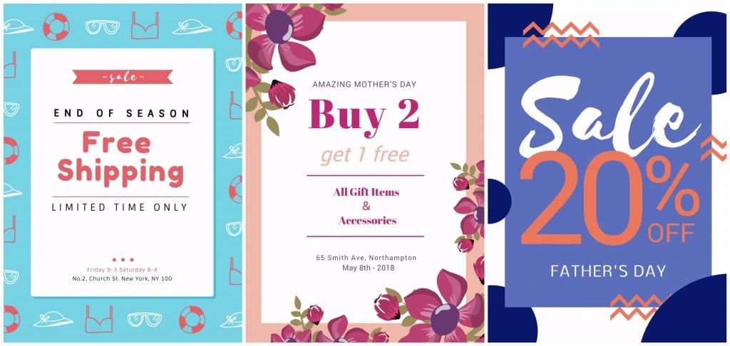
Many business owners make the mistake of trying to pack too much information into a banner ad. Remember, you only have a small piece of web territory to work with. To make the most of it, you need to make one simple point with clarity.
For example, this banner ad is crowded with text, subheads, and images. The average reader will skip over it. It requires too much effort to read.

Compare the above ad with the revised simple and clean example below. It says one thing and one thing only.

Notice how this banner ad attracts your eye to the headline “Summer Beach Party” and the text below it. The graphics act as a frame to help you stay focused on the message. Get more information in our previous blog: How to Make Your Words Standout and be Read.
Strategy 2 – Communicate One Strong Benefit
A successful banner ad communicates one benefit to the reader. That benefit could be a brake job you can trust or a romantic hideaway on some lush island. No matter what business you are in, you are selling a benefit to someone. Pick your strongest benefit or determine which one your market most values. Make that the message.
In these examples, the designer emphasizes a strong benefit statement that can’t be missed. Notice how these benefit messages are the largest elements on each banner. Notice too how the designer positioned these messages to be the first thing a reader sees. The designer gave the benefit priority.
Strategy 3 – Make it Exciting
A banner ad usually resides in a neighborhood of banner ads that are all screaming to get a reader’s attention. To be successful, you need to use some clever design techniques. Here are a few that work.
• Don’t use more than two colors – too many colors add confusion
Notice how the simple use of two colors in this example adds visual excitement and interest.

• Create contrast – a vibrant color with a neutral one creates contrast; a bold headline with a thinner weight font for the subhead creates contrast; white space creates contrast; type reversed out of background creates contrast
Notice at how the generous white space in the center and the use of warm and cool colors draw your eye to this banner.

• Don’t use more than two fonts – a heavy weight font with a light weight font is good design and so is a serif with a sans serif
In the example below, the contrast in font weight or thickness attracts the reader to that all important benefit message.

• Only use a fancy font for a headline – never body copy – and make sure it is readable
In the example below, the fancy font attracts your attention in a fun way. While fancy, it is still readable. It was also not used for the smaller body text that provides important details.

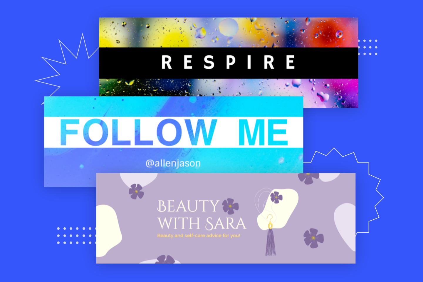
Strategy 4 – Design with a Dominant Element
When designing your banner, prioritize your information. If the visual is the most important element, make it the largest thing on the banner. If you want the reader to see the headline first, make it stand out. To attract attention, it is important to have one element dominate the layout, but don’t make that element so large it crowds out the other two or three elements you need. It also helps to give that dominant element some breathing room. Notice how these examples make the most of a dominant element.
These effective banners use a dominant element to attract attention and draw the reader to the benefit message.


Strategy 5 – Keep Your Banner Ad Design Consistent With Your Brand
If you use certain colors or images, use the same for your banner ads. You want your brand identity to be consistent and strong. Banner ads accomplish this.
Why Use Banner Ads?
Banner ads can effectively draw people to your website. When designed well, they will attract attention and communicate your strongest benefit. Banner ads can also remind readers of your business and your brand identity.
Strategy 6 – Place Your Banner Ad Carefully – Strive for Maximum Impact
As with any good marketing strategy, it is important to place your banner ad where it will reach the readers who need what you sell. Don’t place your ad on a blog that has few followers or on a website that has so many different advertisers your target market will miss your ad.
Instead, place your ad on blogs that write about your industry or on websites that are popular with your market. If you communicate your benefit to people likely to need it, you have an excellent chance of attracting potential buyers to your website and business.
Good luck and wave your banner proudly.