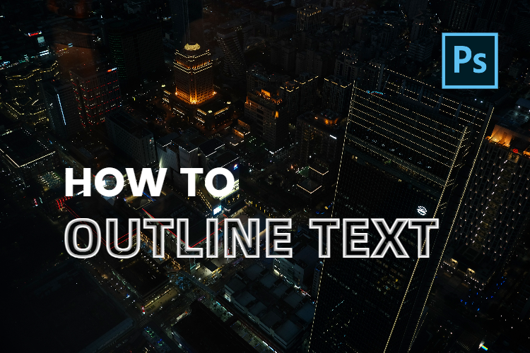
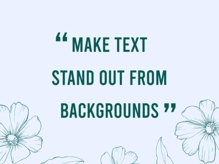
How to Make Text Stand Out And More Readable
Whether you are aware of the fact that although the picture is worth a thousand words and can tell a story, it cannot tell the whole story. In reality, many people overlook the importance of the text message on the picture and design.
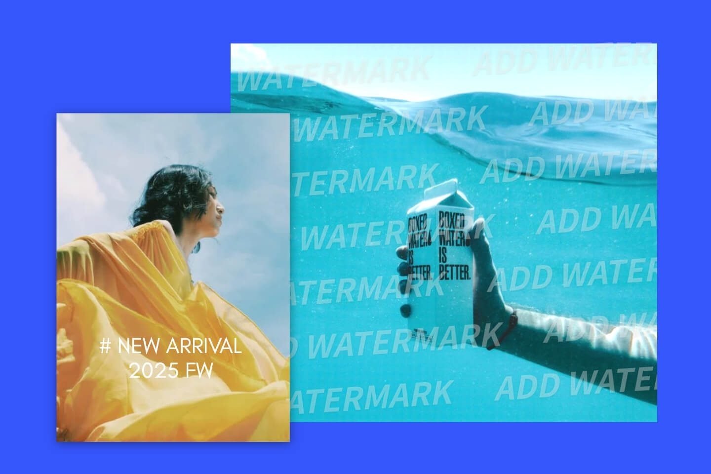
How to add text over image and make text stand out has always been an important lesson when designing. Here are 6 simple rules for creating layouts you will read. And you’ll learn how to place text over images to make your type pop from the background and get a great response!
Rule 1: Headline Is the Star – Not the Supporting Actor
The headline is the text indicating the nature of the article below it and has always been the most critical part of the content. When a reader sees a poster for the first time, what catches his attention, besides the fancy picture, is often the headline of the content. Headline provides the readers with general information in a short amount of time and allows them to decide if they want to continue to find out more. Therefore, headline deserves a place of honor in your layout. Pictures should not get in their way.

Since the layout on the left does not pay tribute to the headline, the reader enters the design at the microphone and travels down to the body copy. Lacking a general understanding of the information in the text, they may lose interest in reading the body copy. As the picture of the poster is just a microphone, a reader seeing this might think it’s a concert or singing contest, or that it’s singing rock songs or jazz style.
The layout on the right uses the microphone to draw the eye directly to the proudly displayed headline below it, which not only makes the layout better looking, but also allows the reader to grasp the main point quickly. The advantage of placing the headline in this way is that it will pique the interest of the target audience in a precise way, which will increase the effectiveness of this poster greatly.
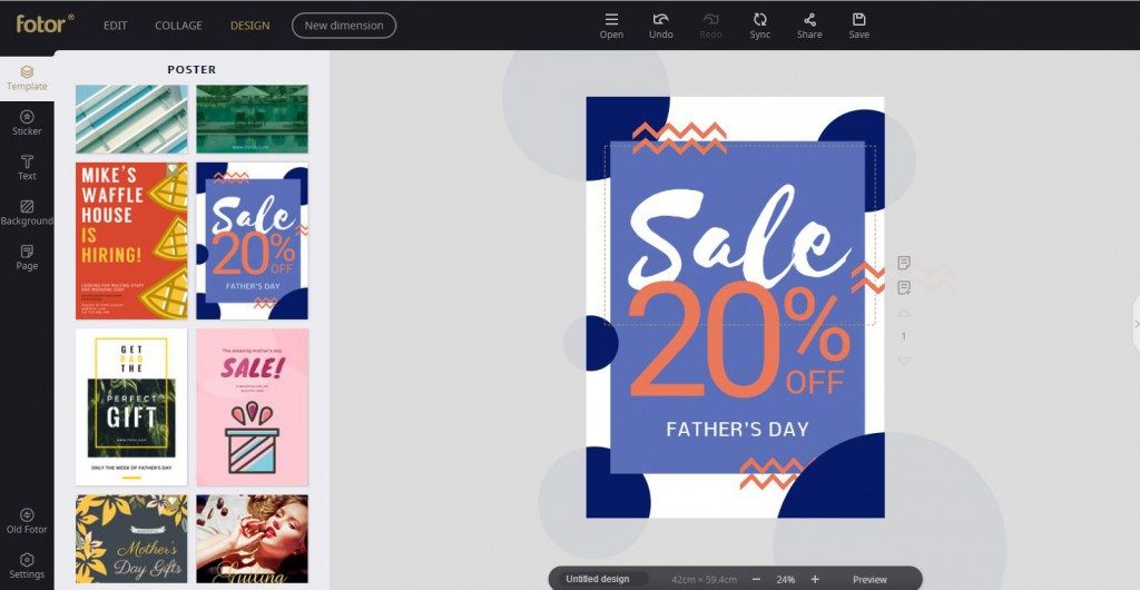
If you go to the Fotor design platform, you will find dozens of beautiful design templates. You can use these templates as they are, or as a base for your own design. All of them make the headline the star.
Rule 2: Contrast Gets Our Attention
Contrast is the difference in luminance or color that makes an object distinguishable. In visual perception of an electronic display, contrast is determined by the difference in the color and size of the object and other objects within the same field of view. For a poster, words and images in a monochromatic palette are inevitably monotonous. Looking back at popular posters and magazine pages, on the contrary, they usually have very distinct color and layout variations. If you are not satisfied with your designs, adjust the color and outline of fonts to make text stand out.
○ Color Contrast
Adding a hint of color can also add visual interest to a picture. Make sure that the text varies enough in color to look in conjunction with the photo. Usually, if your photo has a dark background, choose a light colored text. If your photo has a light background, choose a darker font treatment.
However, there are subtler ways to highlight text. One uses contrasting colors that are not seen in the image, while the other uses tones that contrast with the image. Both of these techniques can be equally effective.

○ Type Contrast
Contrast can also refer to the size of the text in relationship to what is happening in the image. Lettering should work with the image, not against. When designing with type, show a marked difference between the headline and the text or body copy. One way to do this is by making the headline larger than the body copy, but if you make the headline bolder, it becomes an eye magnet.

The layout on the left has minimal contrast. Although the headline is larger, it does not stand out. Notice how much more interesting the layout on the right becomes with a bolder heading. You want to read the headline and the story below it. Also, it’s equally important to choose a beautiful font for your headline, and with hundreds of fonts available on Fotor’s design page, you’re sure to find the one you like.
Rule 3: Notice the Layout
As simple as it sounds, the layout can play a large role in how your text displays on a screen. Depending on what you have on screen and the color of your text, the layout can make your graphic stand out or blend into the background.
○ Overlay
How to make the text stand out on a busy background has always been a serious problem. An effect that is becoming more popular is the use of color casting over images to allow for text placement. What you need to do is choosing a high intensity color, which could be a solid color or a gradient one. The key point is in making the overlay color transparent enough for the image to show through, but not so transparent that the text is difficult to read. You may have to experiment with several colors and photo options before mastering this trick.

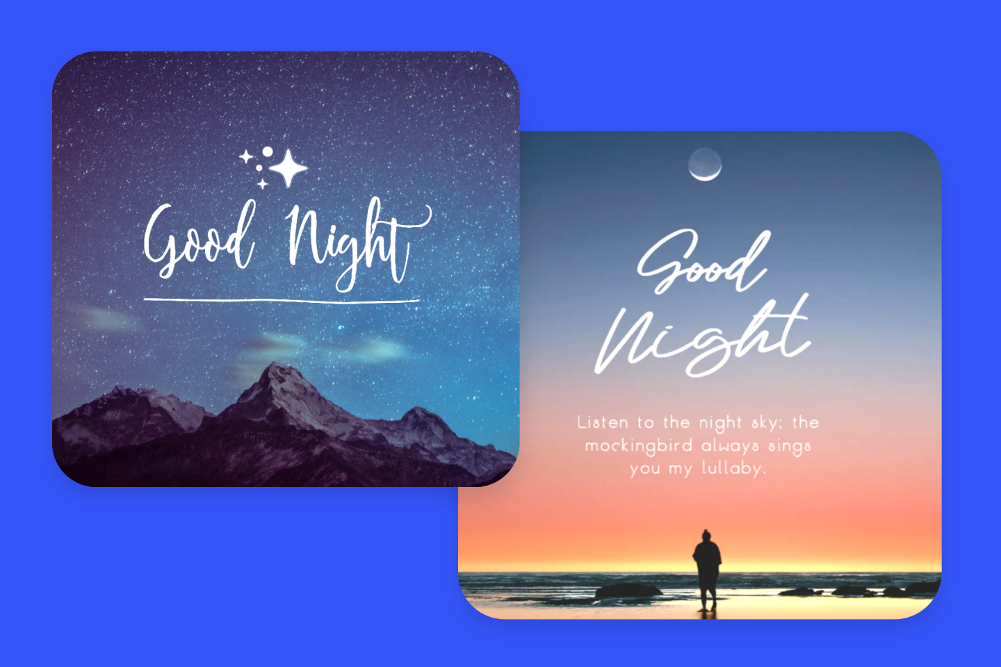
○ Vertical Rhythm
We can also try to break the rules when it comes to text layout by moving the text to the edges of the image. But it’s best to do this in cases where more text will affect the aesthetics. If the image is oriented vertically, we may apply vertical elements to the text as well. The vertical rhythm was quite popular in the last few years. Although the mainstream has undoubtedly cooled off a little bit, yet it still is warmly welcome. It feels like the online audience is not ready to let it go. The solution gives us lots of room for creativity and certainly provides projects with a marvelous tint of mysterious Eastern Asian cultures.

Rule 4: Don’t Forget Creative Elements
In addition to the layout and color of the text, you can also add creative elements to the image, which will not only add to the aesthetics of the image but will also make the layer of the image richer to emphasize its design. What you need to do is to use shapes or lines to wrap or differentiate the text and make it stand out.
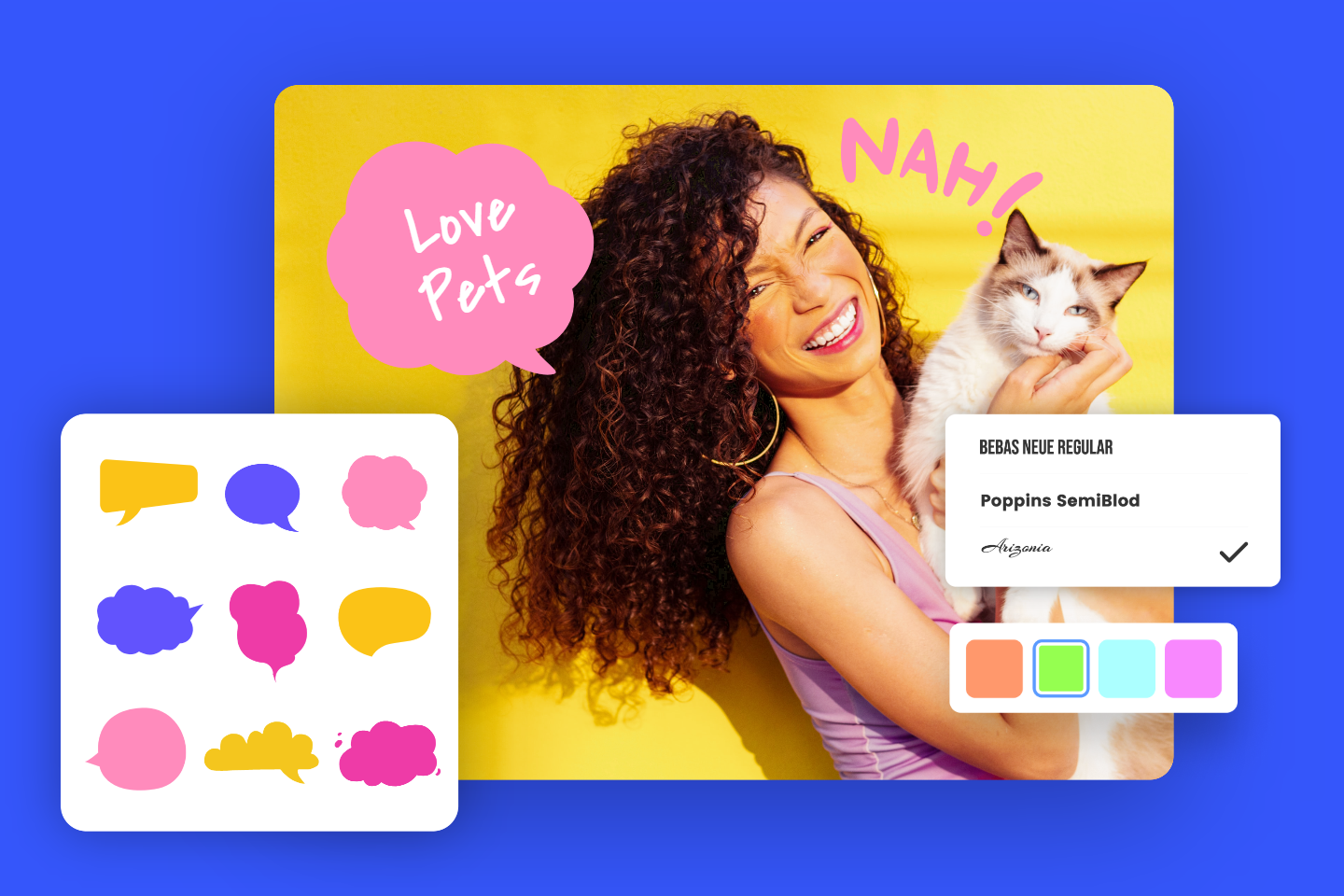
○ Interesting Shape and Sticker
Adding a sticker or a basic shape under the text is has always been a classic way of making the script stand out. You can just simply add a basic shape and adjust the color. Then, optimize it by adding the edge to it. And you’re all set to put the text message on it. Be sure the font, size, and color just match perfectly with the overall design.

One thing to note when using stickers in design is that if the image is of some personality, you do not block off the person’s face.
○ Line Separator
Here’s another easy and commonly used design trick that professionals use to make the content stand out without fiddling much with the image. This tip also only applies to visual themed images that don’t have a lot of text.

The text is readable but can be made better just by adding a line or rectangle shape over and below the text. This tip will make the overall style more coherent while making the text stand out.
Rule 5: Blur the Image
Most of the time, you want to use a picture just to set the mood. For example, there is nothing in the picture that is worth the attention of the audience. This is where you can use this tip.

In the poster above, a meeting is in progress. However, the theme of the poster is only to make an announcement, not to show who is attending the meeting. Also, the presence of both the photograph and the headline on the poster would have an impact on the readability of the headline. So how to how to make text stand out from background? Blurring the image background is a good choice to try. The blur effect can add focus to your overall concept and bring the actual product and text into sharper focus for users of the site. This effect helps to remove emphasis from the finer details and instead conveys the overall nuance of a photo. If you don’t want the image to grab the viewer’s attention from the text, you’d better try it.
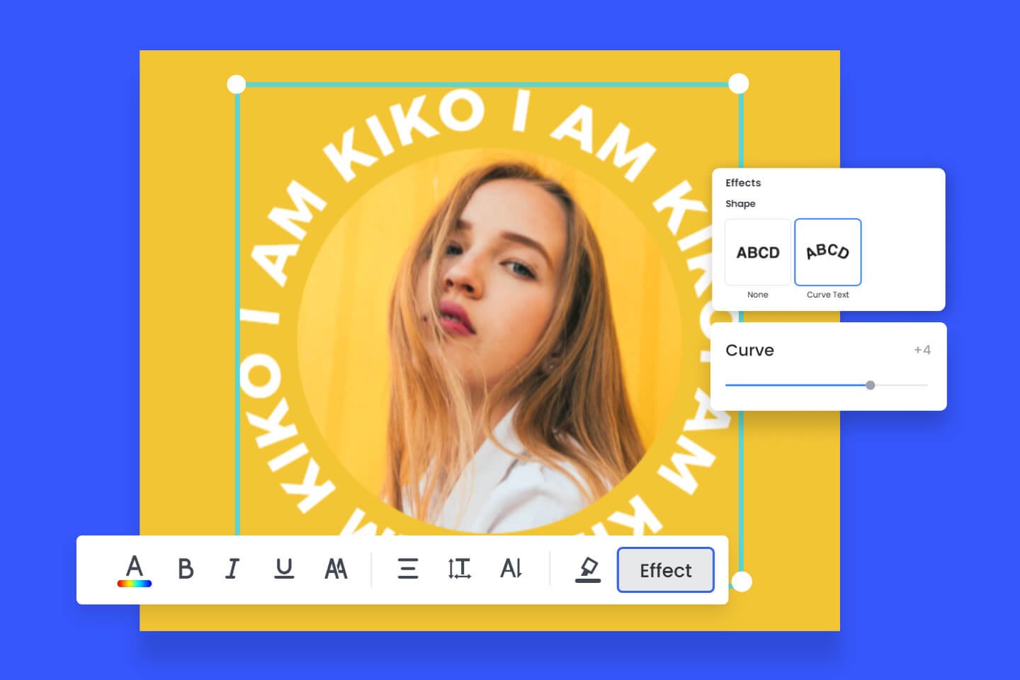
Rule 6: Type as Illustration
You can use type as illustration by putting your headline on an angle, running it vertically, or sizing it so big that part of it goes beyond the boundaries of your layout. Often a small and decorative font, line, or symbol is used for this and the letters in the words are modified to add to the effect.
Although the graphics take a large place with very little text in this template, it’s not monotonous, which is benefited from the designer adding some illustrations to the edges of the canvas. You can find many examples among Fotor’s templates. The layout above is just one.
Conclusion
The combination of pictures and text can not only arouse the reader’s interest but also be more effective in getting the meaning across to the reader. But don’t forget that text is what conveys the most accurate message. Follow these 6 simple rules and make your text stand out, then your audience will always read your content. Your layouts will look great, too! Go to Fotor and start your design right away!