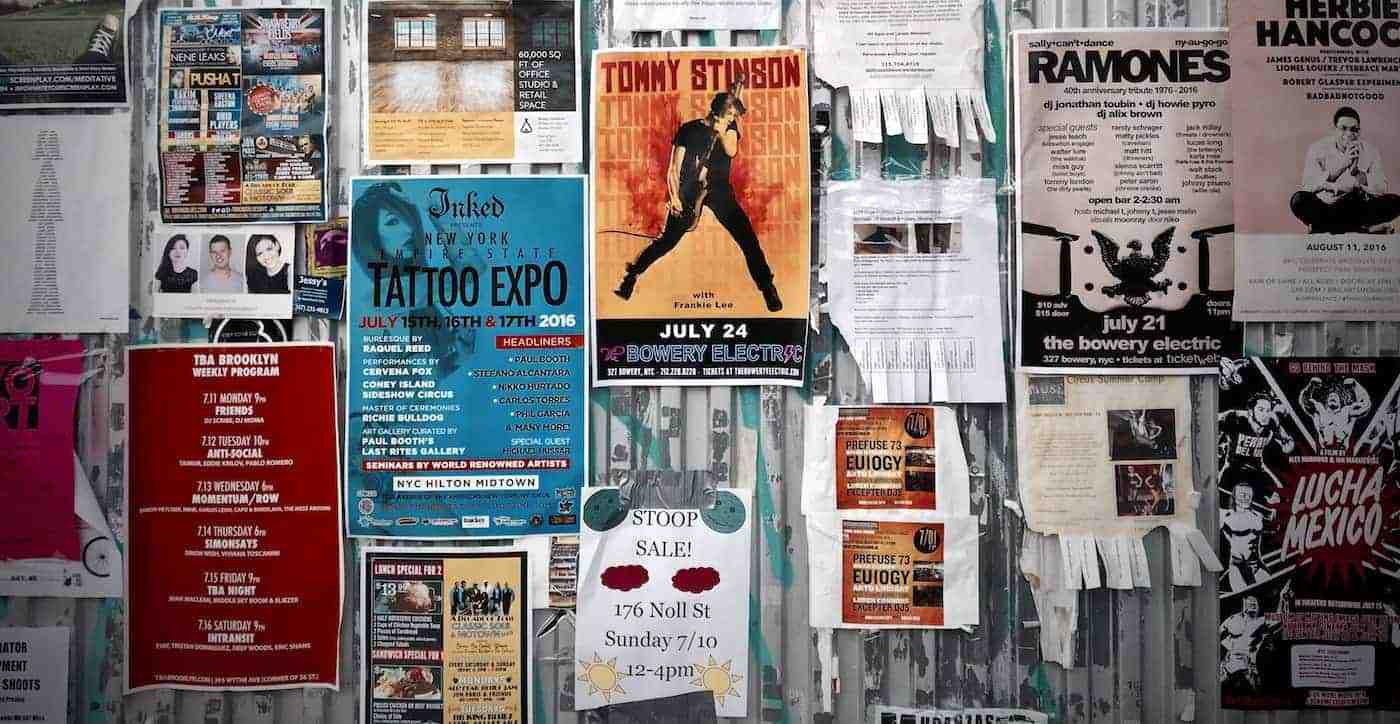
DIY Super Summer Sale Posters

Summer is a great time for businesses to showcase their wares, schools are out and vacations are in, so why not release new promotional material to get the market interested? If the answer is that you haven’t made a promotional poster before, don’t sweat it we got you covered!
This article is divided into 2 parts the message and the graphic design aspect where we take you through the planning and executing of your ideas using our acclaimed website – Fotor.
Part I – The Message:
Like a business plan, making an ad is all about using less to make more, and while the temptation to go all out and make a super flashy poster without substance is just adding more to the advert clutter, that bombards potential clients in many aspects of their daily lives. This section will help you focus the message you want to convey in the best way possible.
1. General promotion
Marketers know that most of the time their ads serve not as a way to attract new customers but rather to retain and remind their loyal ones why they chose their product in the first place. Hence big brand names who have reached the product maturity (and don’t want their goods to go into the decline stage) need ads to keep the momentum going. But to get to that point small businesses need to push and expand their sales and the way to do that is simply, advertising; letting people know that they are there.
Ads tend to focus more on the ‘cool’ factor which translates to celebrity endorsements, flashy graphics, and making loyal customers feel good about themselves for supporting your brand by declaring charity work on a local or national level.
No money for hiring famous people or charity drives? No problem; start simple with a long term campaign in mind: keep making posters and ads and beam them onto different mediums. This means not just having indoor and outdoor billboards but try mixing virtual and print channels (that aren’t as expensive as they once were) and market research coupled with smart targeting can take your posters to the market segments that are most likely to buy your products or use your services.
2. Focused message (Deals, Sales, etc.)
I can give a million cases where businesses both big and small blew a ton of resources on messages that were too generalized and didn’t inform the client of the who, what, and where aspects of their goods and services. The content then needs to be something a little more targeted and since it’s summer and a good chance to unload all the excess stock from last season here are some examples and considerations of your content…
• The who/what?
This is aimed at new businesses or existing ones entering new markets, while it is a no brainer but many ads focus entirely on getting your attention and then lose it when the customer doesn’t exactly know what are they promoting.
• The where?
Businesses lose plenty of interested clients because they don’t clarify where their stores or point of sales are physically located. (Sometimes a simple arrow is all you need)
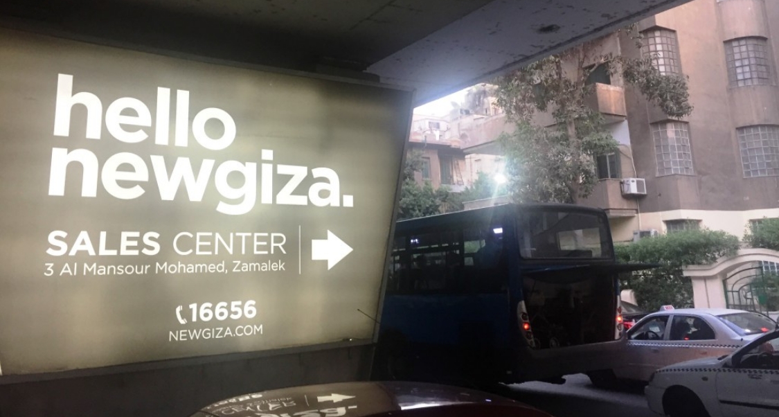
The arrow clearly points to the office and the name/contact info are clear enough to be seen driving by…
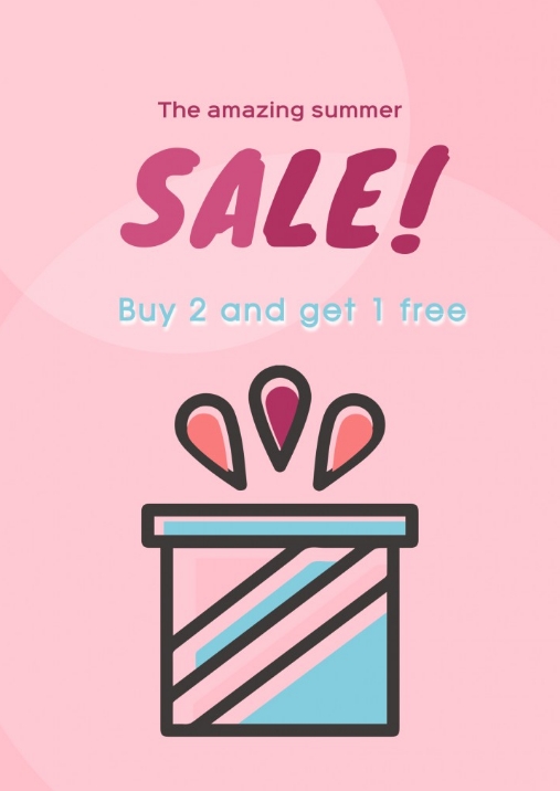
• Freebies and 2 for 1 deals are loved by one and all no matter how much of a cliché they sound, however make sure your target market (usually local) will like the style and the message is clear with both the wording and the design.
• QR codes, hotlines and many others can link your potential client to more info, but bear in mind the location of the posters and ask yourself “Would I have the time or flexibility to whip out my phone and scan this poster?” Strategic placement both physically and mentally is of the essence…

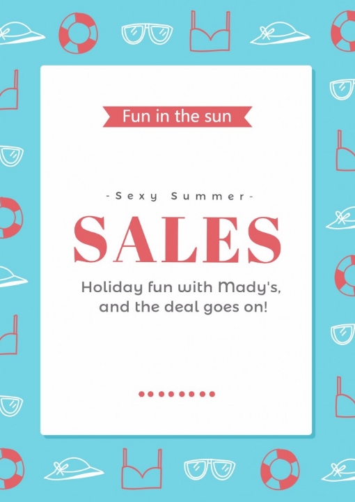
• Watch your wording: For summer themed posters be sure to include the vocabulary that complements the elements of summer; words that rhyme Sun=Fun
• Hot summer sale! A known cliché but that’s not a problem cause if people didn’t like clichés they won’t be using them, so don’t shy away from using overused slogans and catch phrases for seasonal ad posters.
Part II – The Design:
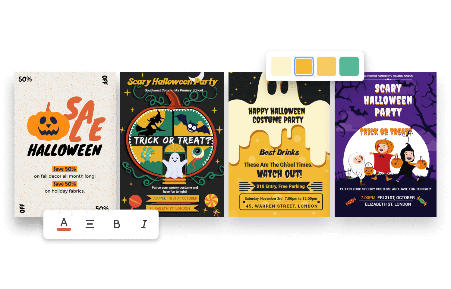
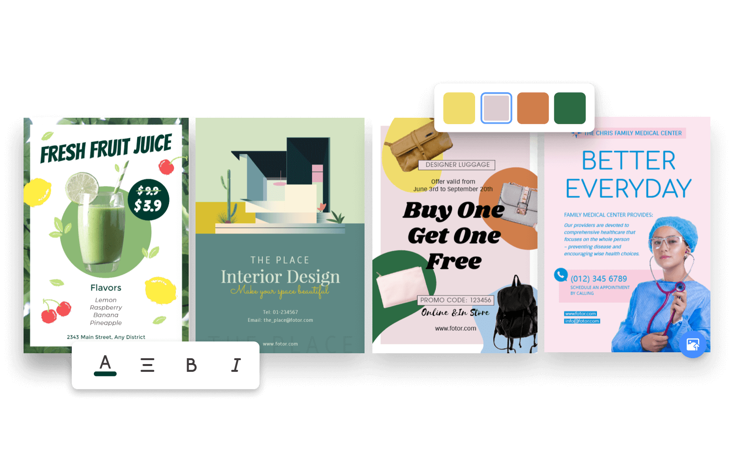
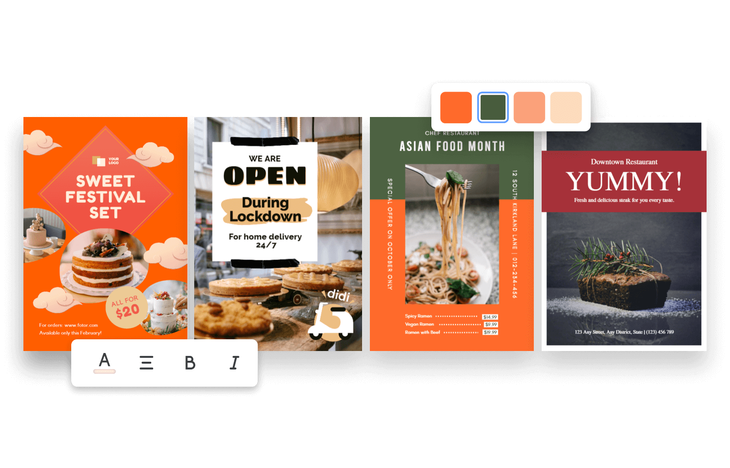
1. Color Schemes
In most parts of the world summer means hot weather and your color schemes should reflect and complement that:
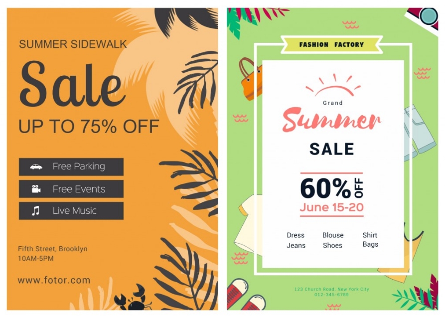
Warm and bright colors (reds and oranges) should be top of the list however…Too bright can be a turn off and an amplification of the heat so slightly cooler hues of cobalt/teal and pistachio shades rather than dark blue or atomic green would be easier on the eyes so cream and beige backgrounds with brighter color fonts can be the middle ground you’re looking for… Try to understand the difference of using warm and cold color as main color on the sales poster…
2. Fonts
• Add excitement
The world of fonts is becoming bolder and more exciting; take that to your advantage.
While many ads go for simple and readable or even clichéd fonts… Don’t forget to add more text effects such as drop shadows to add even more excitement to the script.

• Combine different languanges
Many people have come up with new ideas even merging different alphabets of various languages to cater to several target markets in the same time.

Aravit is a Hebrew Arabic mash-up by Liron Lavi Turkenich encouraging more integration in divided societies.
While creating a new font altogether might be a bit overboard, keeping things too simple and plain black and white unintentionally is not an option in this day age. Striking the right balance between different fonts and their colors can make the information most vital for the customer stand out avoiding a monotone (boring) themed poster.
• Shouting the message out
People have always imagined the tone translated into the “voice” of what is written and the use of superscript can MAKE YOU IMAGINE A SHOUTING VOICE, that effect has to be used when appropriate to portray the right effect to the viewer.
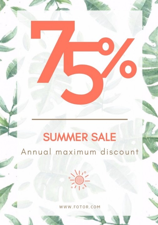
Using super big number to make the discount information really stand out.
• Manage the style based on your target audience
For summer in particular many opted for the vintage feel reminding the baby boomer generation of the beach and its positive association with their childhood. However it does seem to play well with younger generations too.
Younger customers might something a little more modern and edgier but then again such choices are relative to the locale and market segment in mind and of course the type of company you are.
So if in doubt on which of the thousands of font out there is right for you checking out what the competition have used can be a good indicator of what and what not to use.
Keep these tips in mind, and you’re a leap closer to a better design!